The Art of Living in Color
Color has the power to shape not only how a space looks but how it feels. It is the first thing we perceive, the emotional undercurrent of a room. Used with intention, color can transform an ordinary space into one that tells a story.
Color as Emotion
At its core, color is emotion made visible. Blues evoke calm, yellows energy, and neutrals serenity. But it isn’t about following strict rules; it’s about using color as a language. A rich cobalt wall can feel meditative or electric depending on its surroundings. A soft blush accent can add warmth and elegance without overwhelming.
Balancing Play and Restraint
Designing with color is a balance between expression and discipline. Too little color and a space risks feeling sterile. Too much and the eye loses where to rest. The secret lies in contrast: pairing vibrant tones with natural textures and muted backdrops. A bold ceramic tile or cushion can shine when grounded by stone, wood, or linen.
Contemporary Meets Classical Theory
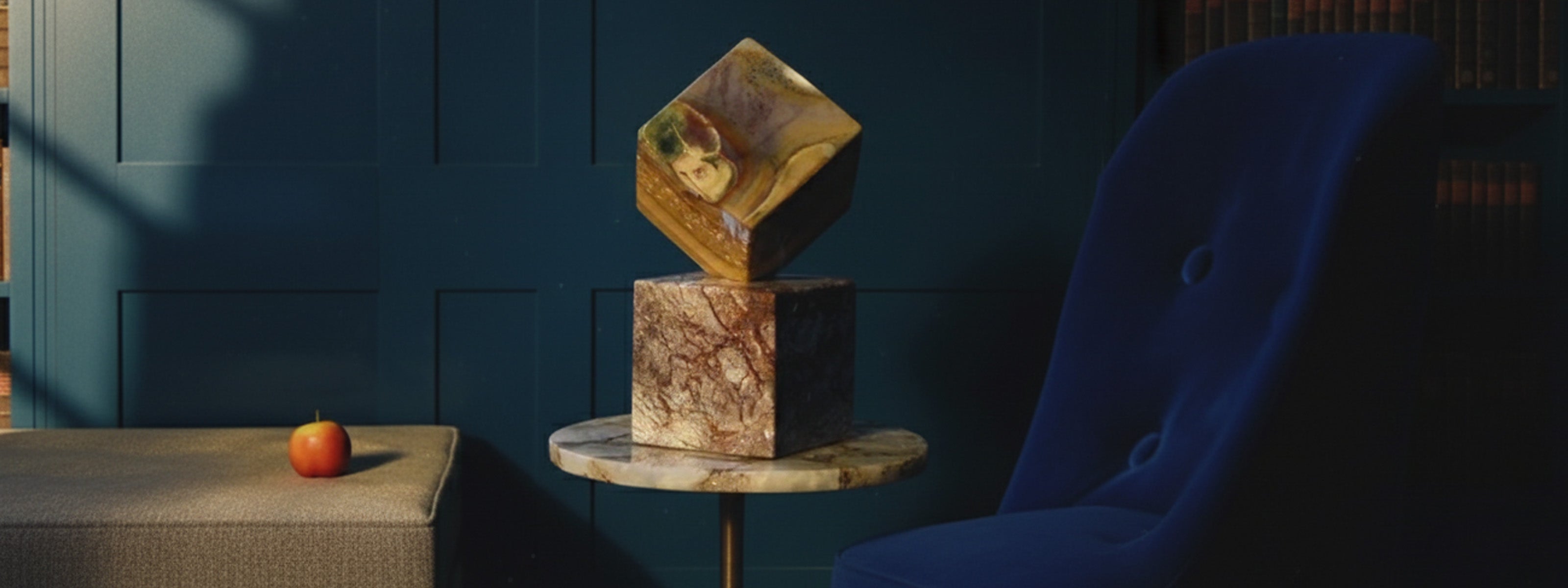
In classical color theory, complementary hues such as blue and orange create harmony through opposition, each making the other more vivid. Contemporary design builds on this idea by layering unexpected combinations: ochre with lilac, terracotta with teal. These juxtapositions bring depth, surprise, and a sense of motion to a room.
Letting Nature Lead
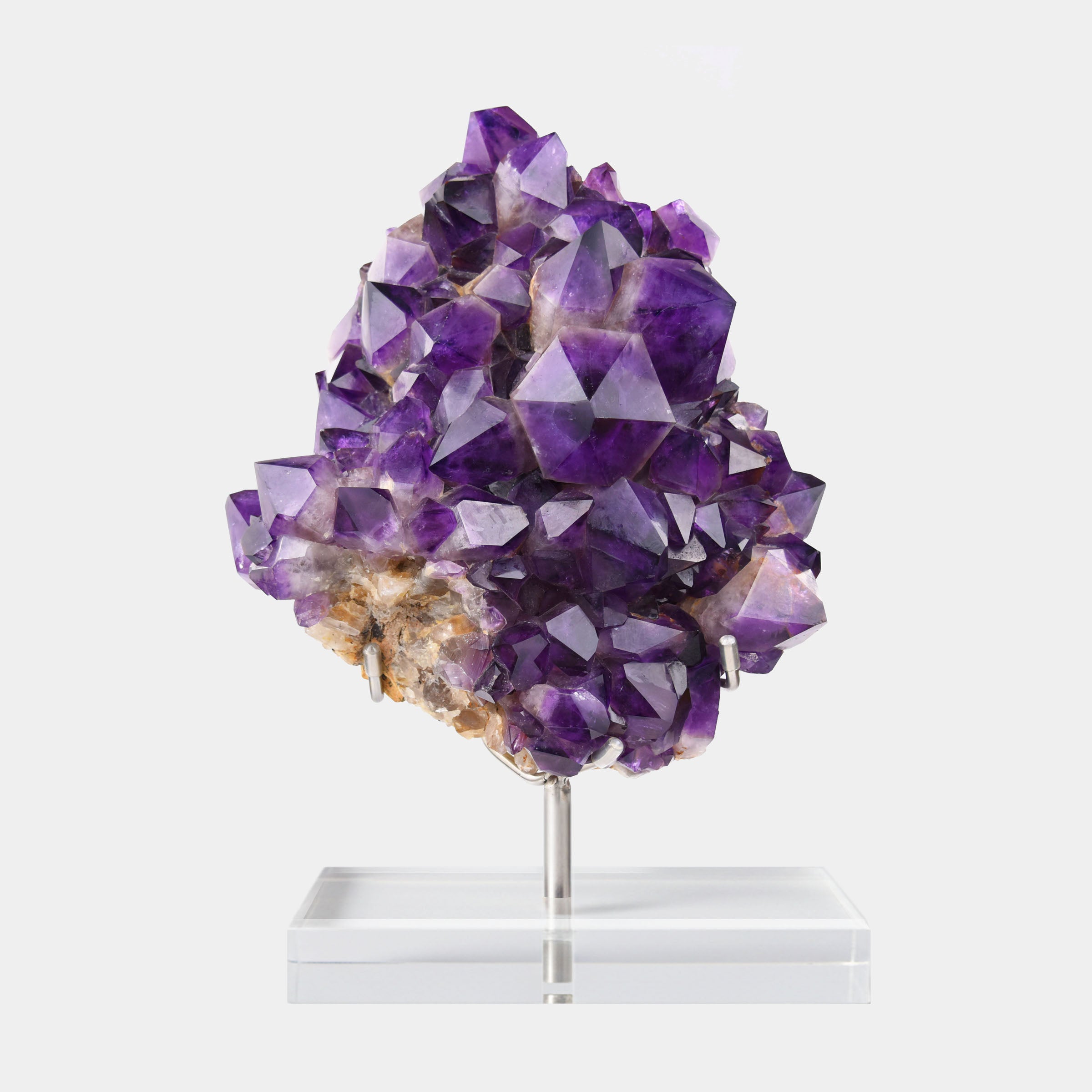
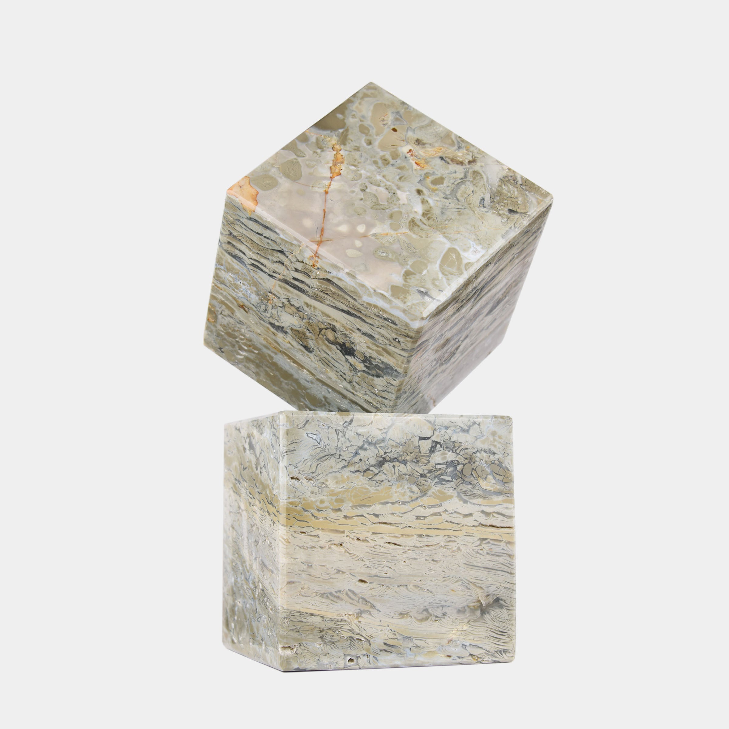
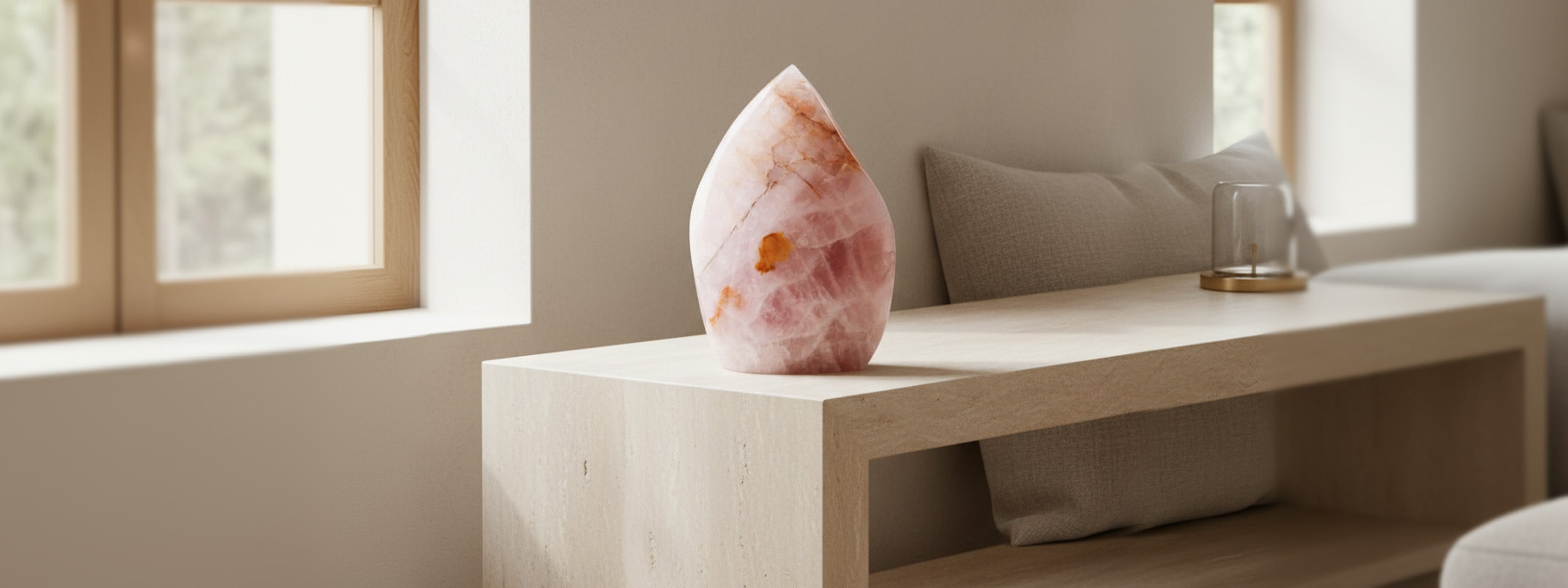
Nature is the ultimate color guide. Look at a landscape: green foliage against warm earth, sunlight filtering through citrus leaves, the soft pink of quartz or coral. These palettes are timeless because they occur effortlessly in the natural world.
Have Fun With It
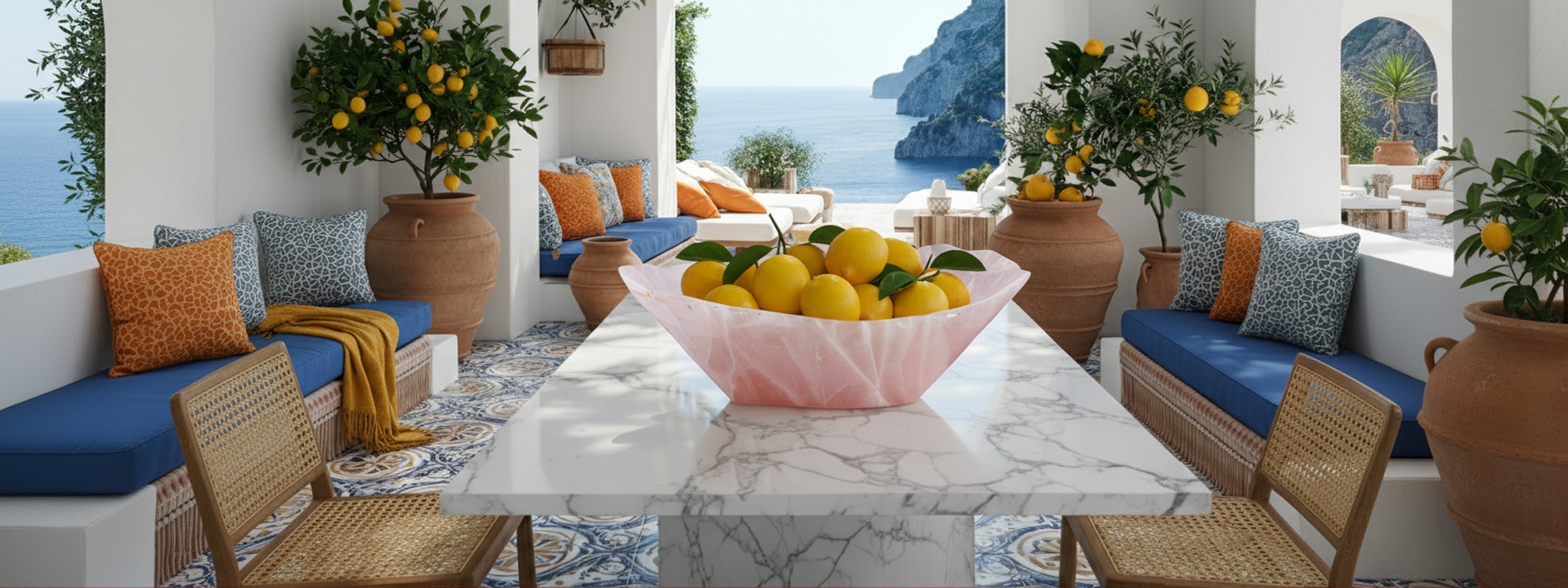
Ultimately, color should bring joy. Interiors are most beautiful when they reflect the people who live in them... their moods, their travels, their contradictions. Don’t be afraid to mix the unexpected: a deep ultramarine cushion beside a terracotta pot, or a marble surface paired with a rose quartz accent. The best spaces feel collected, not constructed.
Pictured above: Large Rose Quartz Bowl from our Functional Objects series, where natural luminosity meets Italian coastal simplicity.
Leave a comment
This site is protected by hCaptcha and the hCaptcha Privacy Policy and Terms of Service apply.